To Build a Culture of Data Visualization – Celebrate!
January 8, 2019 | 3 Minute ReadData visualization isn’t only for ‘vizards’ or data pros. Chris Gegenheimer shares how we can all celebrate data; we simply need to build a culture around it.
With each passing year and technological advancement, society creates more data. This much data can be both a blessing and a curse. We have an expectation that with more data, better decisions will surely follow. Of course, this assumes that we understand what the data is telling us. With so much data coming at us, however, that is not a guarantee. This is when data visualization comes in handy. Well-crafted visualizations communicate messages clearly and help us make sense of all that data.
But, learning how to create clear, well-designed visualizations can be daunting. How many of us have looked at one of those fancy graphics and thought, “That’s great, but I can’t do anything like that?” The title “data vizard” has been thrown around to describe those who know how to do this well — as if they were magical beings. Think about that title for a moment. It’s a cute turn of phrase, but it implies there is something unattainable or unknowable about how to create effective data visualizations. If you’re the resident data vizard, it implies that others in your organization need to seek out your expertise to get what they want. While there will always be room for a “senior data vizard,” our goal should be to create as many of them as possible!
In October, I participated in a panel presentation moderated by Stephanie Evergreen at the American Evaluation Association’s Evaluation 2018 conference. Instead of vizards, we discussed unicorns — those special individuals who are spreading the news, sharing their skills, and working to support culture change around good data visualization. We discussed different strategies and lessons learned from our experiences spreading data visualization culture within our respective organizations. Specifically, we discussed how we were broadening the base and empowering early adopters of visualization to do more and how we were getting more people involved. The panel emphasized the following actions:
- Acknowledge fears
- Communicate importance
- Make it easy
- Celebrate
Celebrate with a “Days of Data” Campaign
While each action is important, I place special emphasis on “celebrate.” Last year, our Monitoring, Evaluation, and Learning Team developed and launched a “Days of Data” campaign where we solicited input from people around the company who had expressed interest in data visualization. We worked with them to identify a message and an appropriate visual. We then built the visualization with them. Once it was ready, we made the visual part of a daily(ish) internal email campaign to highlight projects and support functions in the organization that are not usually seen. As a result, we brought awareness to different kinds of visualizations (e.g., dot plot, scatter plot, choropleth map) and built staff capacity to tell a story with data.
On the First Day of Data …
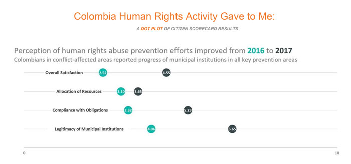
In addition to showing off the newly created visual, we wanted to provide more context and information. In each email, we included the visual (as shown above) and some key points:
- What is the visual? For example, if we did a lollipop chart, we explained what a lollipop chart is.
- Why did we use that visual? For example, why would you choose diverging stacked bars rather than a regular column chart?
- How can readers make their own? For each visual, we linked to a how-to guide (Stephanie’s or elsewhere on the internet) so we could “de-mystify” the steps and encourage people to try it for themselves.
We received several emails of encouragement for the series. That was great, but one of the best outcomes highlights the whole reason for building a data visualization culture. One campaign participant said that she has started to look at her data in new ways and has applied that thinking to her assignments.
Consider doing your own “Days of Data” campaign! It is a great vehicle for widening the circle around visualization — and it is accessible. When you are planning for it, be sure to take into account the time for the creation, editing, reviewing, and discussion around each visual. This can take up more time than anticipated. We have compiled a how-to guide, which details steps for launching your very own campaign, along with key considerations. If we can find ways to make the process of visualization more accessible to our colleagues, we can unlock the power of our data to solve the challenges we face in our work.
Posts on the Chemonics blog represent the views of the authors and do not necessarily represent the views of Chemonics.

About Chris Gegenheimer
Chris Gegenheimer is a director for Monitoring, Evaluation and Learning (MEL) Technology and leads efforts in rolling out new data collection, management, analysis, and visualization technologies across home and project offices. Since joining Chemonics, Chris has been in the MEL department supporting proposal and project teams in Latin America and the Caribbean, Asia, Africa, and…