
3 Misconceptions People Have About Data Visualization and Infographics
May 9, 2016 | 4 Minute ReadCommunicating data to decision-makers can be a challenge. Graphic designer Anna Kuipers sets the record straight on three misconceptions she has encountered about powerful tools for sharing data: data visualization and infographics.
The global development community is increasingly emphasizing the importance of quantitative indicators to measure projects and progress toward development goals. What does this mean? We are about to be awash in raw data. Development organizations have a pretty good handle on collecting data, but how do you go from having data to making evidence-based decisions? What links data to decisions? One word: communication.
Data visualization and infographics can be powerful tools for communicating data. Visualizations can tease out a story, trend, or a point where bulk data may be difficult or time-consuming for people to understand. As a graphic designer at Chemonics, I primarily work with infographics that pull data from multiple sources to tell an integrated narrative. Throughout my career, I have run across a few common misconceptions about infographics, as well as data visualization in general, that I’d like to replace with facts given the growing importance of communicating data.
1. Infographics always distort data by over simplifying it
An infographic should never be misleading. When dealing with data, it can be difficult for people to see the “big picture” through all the numbers. The purpose of an infographic is to bring that big picture into focus while being true to the data itself. To avoid distortion, a designer’s first step after acquiring data should be to fully examine it. A designer won’t be able to communicate data properly if he or she doesn’t have a complete understanding of it. Some fundamental questions that every designer should ask include:
- How large is the collection as a whole, and how widely do the numbers range?
- What type of data is it: qualitative, quantitative, or categorical?
- How does the data reflect the indicators underlying the data collection?
- Does the data reflect the project’s long-term goals?
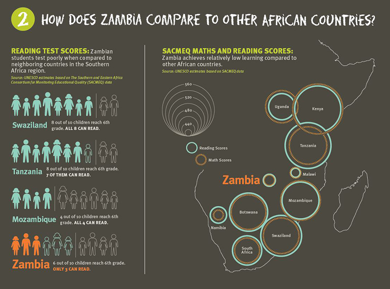
The graphic above, created for the USAID Zambia Strengthening Educational Performance – Up program, shows how Zambia’s test scores fare against scores in other countries. It makes the data easy to understand without oversimplification.
2. Infographics should be immediately comprehensible
Infographics activate the quicker, visualizing part of the brain and minimize the slower, thinking part of the brain. Of course, complex data will sometimes require a complex graphic that will take more reflection on the user’s part. The point is to make sure the value of the information is greater than the effort the user put into understanding it.
To do this, first identify ways in which the data can be adjusted or consolidated for the most straight-forward communication. Consider whether data can be removed as superfluous, whether any separate data sets should be merged, or if there is data missing that still needs to be acquired. The data should be as complete and streamlined as possible. Then you can assess how simple or complex the infographic needs to be to communicate the central message.
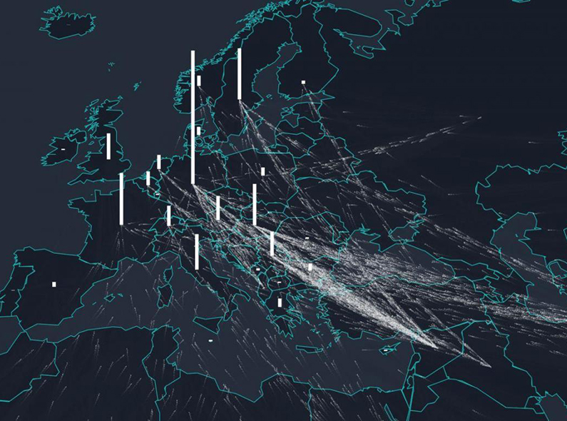
The graphic above is one of a series of complex interactive visualizations from The Independent about the refugee crisis in recent years. They require the reader to put in additional effort to fully grasp but reward that effort with an incredible amount of information.
3. Infographics should be designed to be as eye-catching as possible
The data itself should lead the design of the graphic, and there should be nothing extraneous in the visualization. Users will try to add meaning to any element included, so it is the responsibility of the designer to ensure there are no unnecessary elements creating confusion.
Once you understand the data and it’s been formatted for best communication, that data will direct the visual approach. Data visualizations fall into five general categories under the convenient mnemonic “CHRTS”:
- Categorical: comparative categories of quantitative values (i.e. bar charts and dot plots)
- Hierarchical: part-to-whole relationships and hierarchies (i.e. pie charts and Venn diagrams)
- Relational: relationships through correlations and connections (i.e. scatter plots and bubble plots)
- Temporal: trends or activities over time (i.e. line charts and Gantt charts)
- Spatial: spatial patterns through overlays and distortion (i.e. cartograms and maps)
There are a wide variety of chart types within each category. Exploring how categorical data looks in a bar chart versus a dot plot, for instance, can give you a general sense of the overall “shape” of the data and which type will most clearly showcase the key information or story within the data. This way, the focus is on how informative the infographic is versus how eye-catching or flashy.
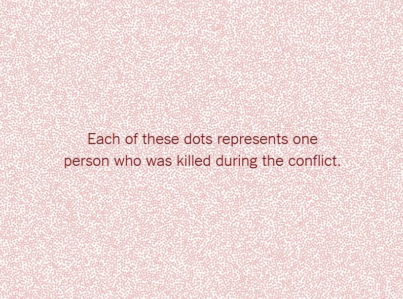
The graphic above, from the New York Times, uses a very simple one-to-one representation to visualize the enormous number of deaths in Syria. The series uses minimal design in order to keep the audience’s focus on the numbers.
Infographics and other data visualizations have the potential to be a powerful communication tool. A common problem in the development sector is that “a single death is a tragedy, a million deaths is a statistic.” As seen above, infographics can help people grasp the emotional impact of large numbers. For further discussion, watch photographer Chris Jordan’s Ted Talk, “Turning Powerful Stats Into Art.”